 After creating a bunch of colorful wedding cards (view post), I decided to make some simpler versions. So here they are!
 The only difference between these two cards is the sentiment. I used the small "congratulations" stamp from Mama Elephant's Oh Happy Birds set to give the card a cleaner look. But I also like the scripty "congrats" die cut from Hero Arts. I heat embossed both of them in silver to match the hue of the gem stones.
 When I first saw Altenew's June inspiration photo (shown below), I was in awe of its beauty and was so inspired that I knew I had to play along! The first thought that came to mind was to recreate the sparkly wedding dress, which I loved but regretted. I'll explain later.
INSPIRATION
The color combination and roses on the left panel were inspired by the wedding bouquet. Same for the right panel, except it has taken the inspiration mainly from the twigs and branches. For the wedding dress, I wanted it to be flatter (or tighter and more fitted in real life) on top and super poofy below the waist. I really tried, but the dimension is so hard to capture in the photos!
 This is the inspiration photo. Isn't it just gorgeous?!?!

 I LOVE this Vintage Roses stamp set. I remember seeing it for the first time in one of Jennifer McGuire's videos and I was like, I NEED that! Super gorgeous. It's probably my all time favorite stamp layering set.
After choosing the different shades of yellow and stamping the roses on a white panel, I heat embossed the flowers twice with clear sparkly embossing powder. For the leaves I stamped with two shades of green, and a third time with the lighter green. Because it's pigment ink, the lighter green covers the dark green a little and helps tone it down. You can see the difference between the lower left leaf and the upper right one.

 For the dress I altered the die cut a bit by cutting off the middle "caged" portion (refer to the product image near the bottom of this post) and double embossed the entire die cut with clear sparkly embossing powder. Then I adhered layers of vellum to create the poofiness I wanted. The right hand picture shows the layers when the dress is adhered to the card front.
 I wish I could capture the dimensional look of this dress. It seems so flat here!
 And the shine from the dress and roses! It's hard to capture the sparkle without getting the glare as well.
 For the right panel I inked it up unevenly with Scattered Straw distress ink. Then I sprayed perfect pearls water across the entire panel to give it some subtle shimmer.
I added some wink of stella to the branches die cut to match glittery look of the entire card and adhered some enamel dots to the center of the flowers.
For the right panel I inked it up unevenly with Scattered Straw distress ink. Then I sprayed perfect pearls water across the entire panel to give it some subtle shimmer.
I added some wink of stella to the branches die cut to match glittery look of the entire card and adhered some enamel dots to the center of the flowers.
 Did you notice the torn edge across the middle of the card? I love the extra little texture it gives. :) For the sentiment, I simply embossed it on a thin strip of black cardstock and cut both ends to turn it into a banner. The silver embossing powder I have is the one from Tsukineko. I like that it has bigger granules than the ones from Ranger or Hero Arts so that the embossed images are raised higher and have more dimension to them. But embossing small sentiments like these can be tricky!
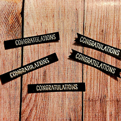 You can see that the top left sentiment doesn't have full coverage, while the one below it had too much powder and melted the letters together. The other ones are more acceptable, but none are really perfect...
 I love the elegant look of this card so much I went ahead and created another card with only the rose images! I'm planning on making more of these with different color combinations of the roses. A pink one is a must!
 For the dress on this card, I added some gems that I heat embossed with the same clear sparkly powder. They're so small you can't really tell the difference before and after heat embossing, but here's a close up of the comparison. The left one with the embossing has a rounded surface, kind of like the smooth gemstones from Hero Arts.
Alright. Here's to the reason why I regretted recreating these beautiful dresses: For Altenew's challenges, one of the rules is that "Altenew products should be the focus." I was aware of that this entire time, even when I was purchasing Spellbinder's dress die specifically for this challenge. For some reason I thought even with the wedding dress in front of them, the floral images will still pop and be the focus. But after creating these two cards, I'm not so certain. Sure, they definitely have more intense colors than the white dress, but I felt like the dress took too much attention away from the roses.
 This is why I created the third card, one that's without the dimensional dress piece. After die cutting the dress shape from the front panel, I laid the die back in and used a sponge dauber to apply VersaMark ink along the edge of the entire die. Then I heat embossed it with some sparkly embossing powder. This creates a glittery halo with a white edge around the dress.
 Again, it's hard to see the sparkle in the pictures, and I wish you could see these cards in real life. Which one is your favorite? Please don't hesitate to let me know in the comments. I would love to hear about your opinions on them! Thanks for stopping by, and have a wonderful day!
Challenges Entered:


 Altenew June Inspiration Challenge
 /
SSS: Add Some Shimmer /
HLS: AG with Dies


 HLS MM: Texture
 /
Stamps & Stencils: Floral Frenzy /
Cards in Envy: White Wedding or Anniversary


 Cut It Up: 3D Projects
 /
STAMPlorations: Celebration /
Craft Rocket #18: Weddings


 The Crazy Challenge: R is for...
Roses, Romance /
Word Art Wednesday #236-237 /
Sparkles Challenge #81: They Say When You Marry In June /
Timbro Scrap Mania #121: Flowers


